Inspired by the journey to rangatiratanga.
Te Tohu o Te Ora o Ngāti Awa provides health and social services. The branding was dated and did not convey the depth of cultural expertise that underpinned their philosophy. Ira was asked to help bring that narrative to life as a new brand identity.
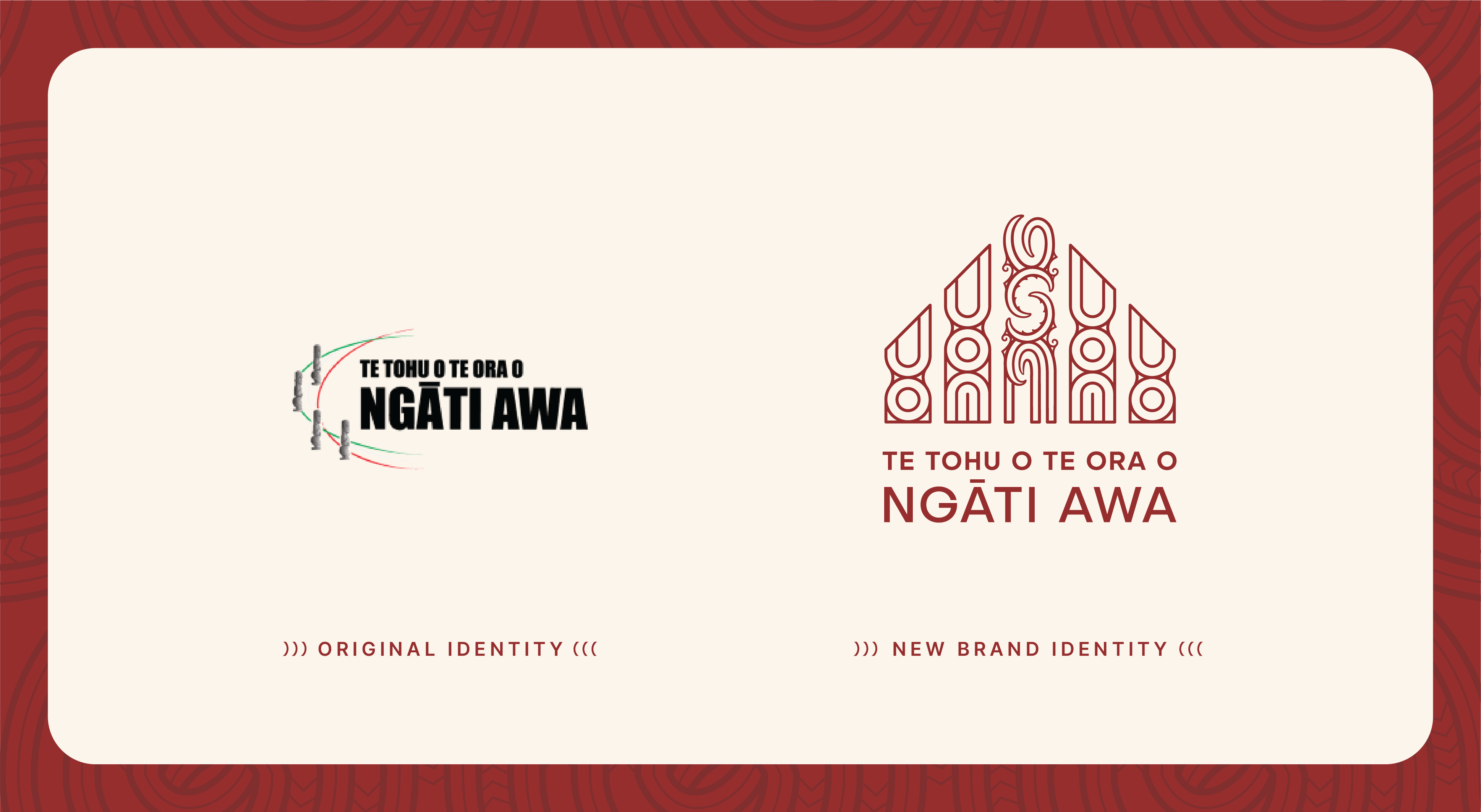
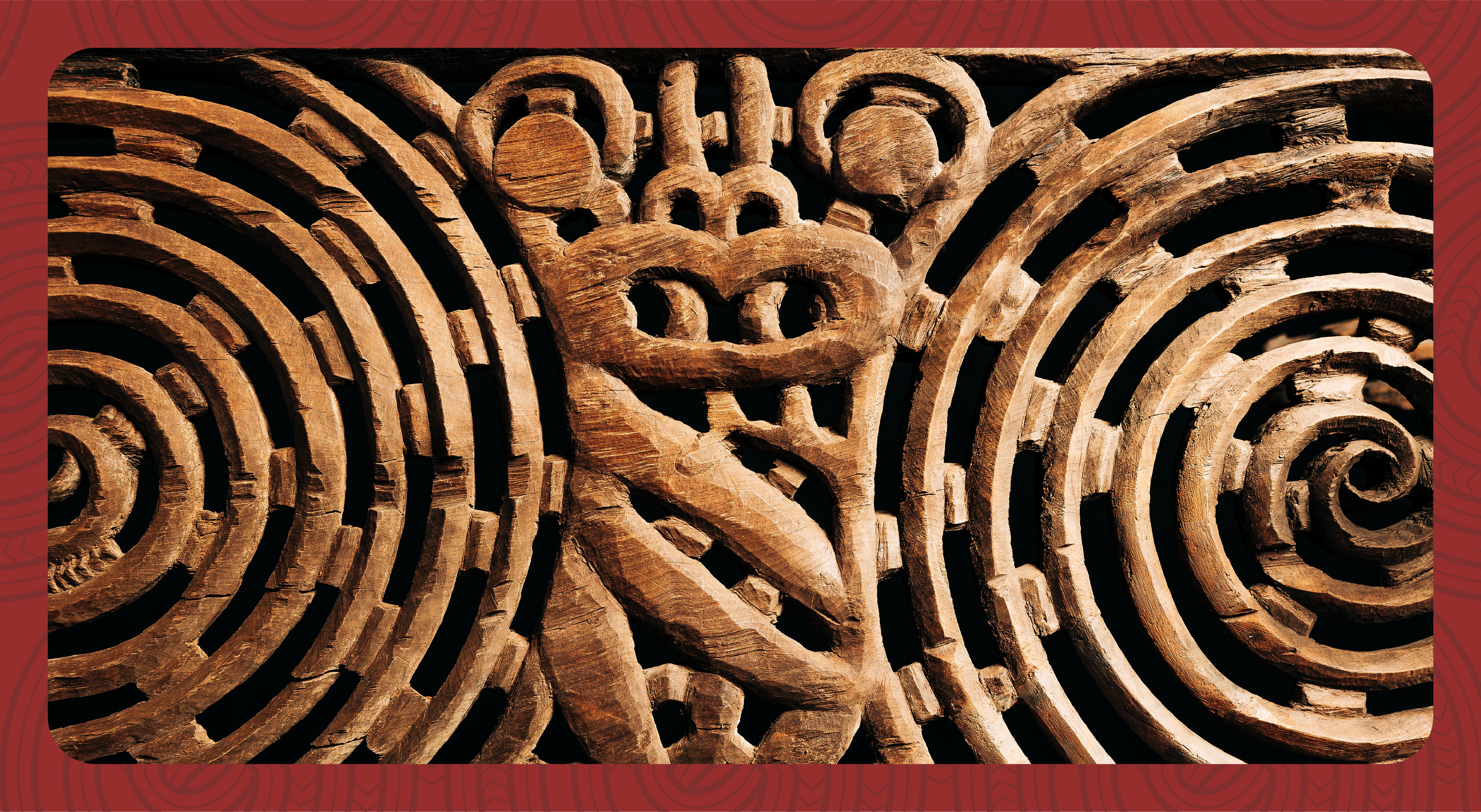
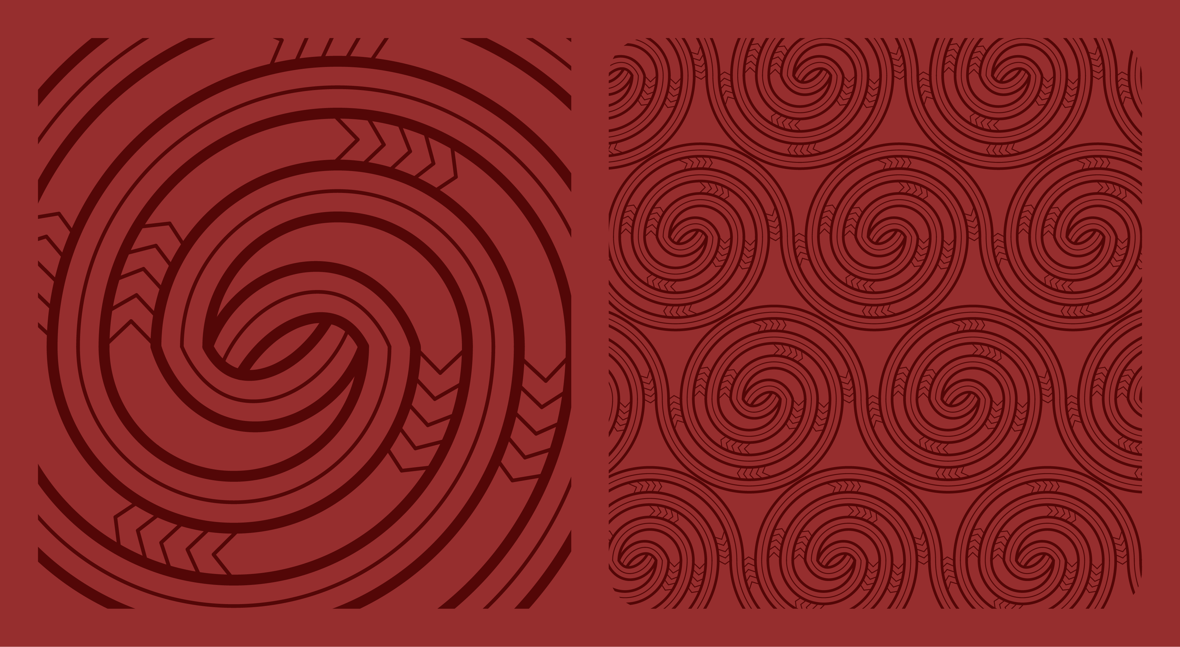
The Pou Mataaho is invisible and exists within the mind and spirit of the person who acquires it. The bottom motif is that of a moko kauae, worn by women and connected to the whenua. The top element is inspired by mataora, worn by men and connects to the heavens. Connecting them both is a rauru spiral representing whakapapa, or family connections.
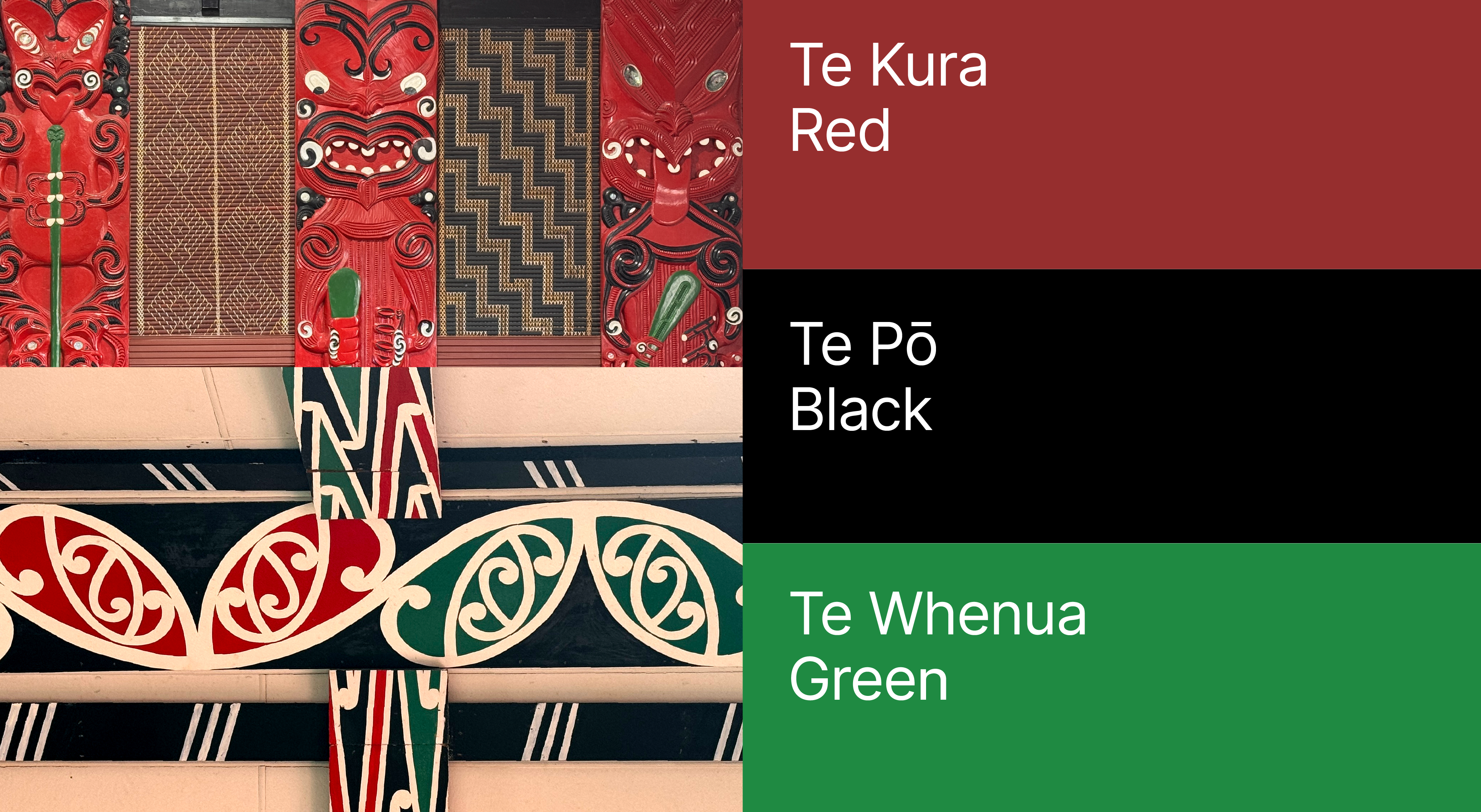
Celebrating Ngāti Awa colours to connect the brand to their place in the world.
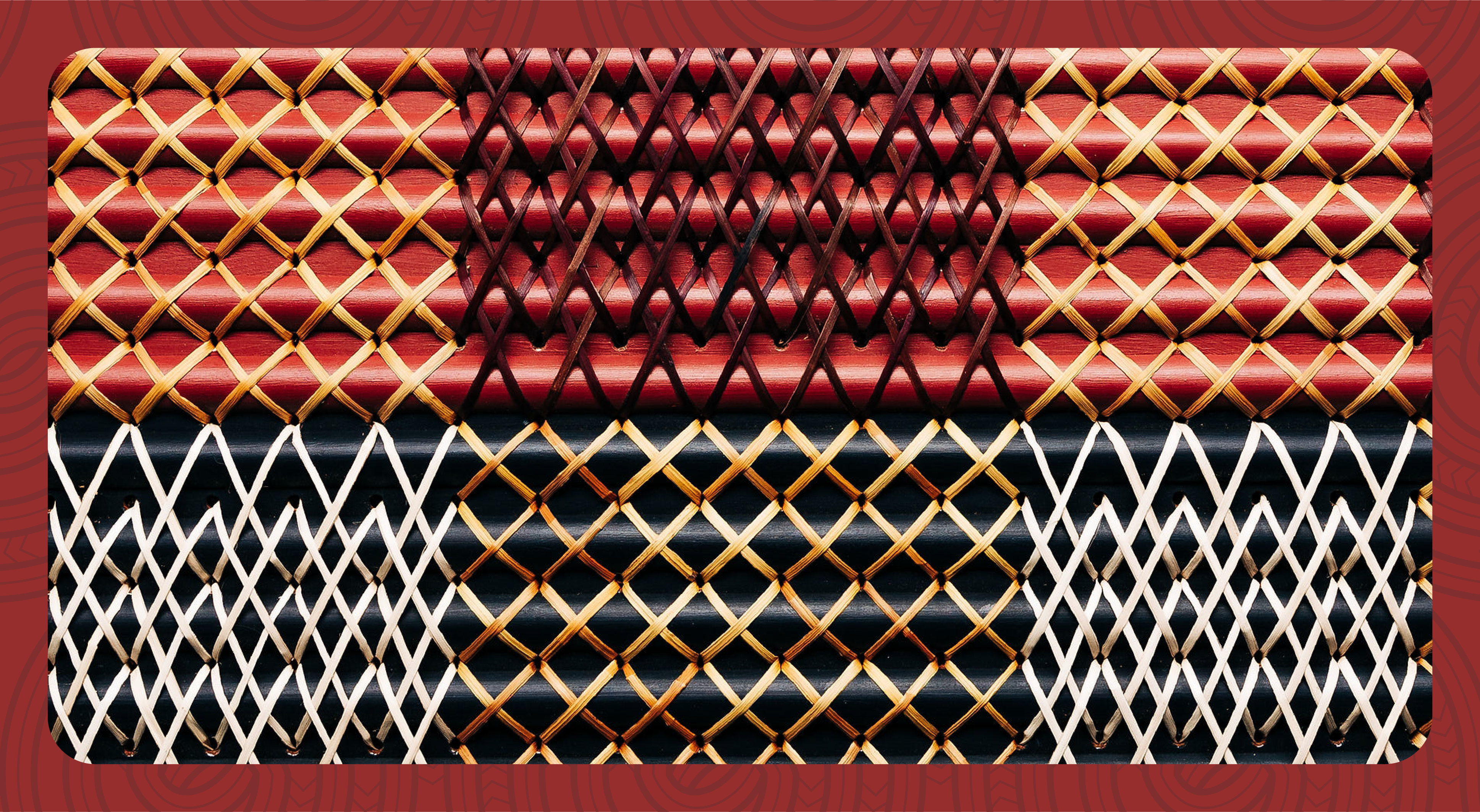
Ngāti Awa colours use a rich red, strong black and vibrant green. It’s used across carving and painted kōwhaiwhai. This expressive colour combination is instantly recognisable to the people of Ngāti Awa.

Aligning strengths and values to define purpose.
Te Tohu o Te Ora o Ngāti Awa provides a wide variety of services and upholds many partnerships across the sector and public service. One of the challenges was to define the core messages that define their strengths, regardless of audience.
Part of this was to synthesize the core essence of 9 key principles and 5 values to make it easier to remember and apply consistently and meaningfully. “Kia” means to be, to embody, to do. These values create a call to action.
Creating a brand that conveys the mana and mauri of Ngāti Awa.
A brand transformation to inspire and energise the people of Ngāti Awa.
Client - Enid Ratahi-Pryer, Desmond Harawira, Marama Studer
Creative Director - Johnson Mckay
Strategy & Communications - Johnson Mckay
Project Lead - Sarai Morris
Cultural Design - Manawa Tapu
Design - Tim Hansen, Storm Smith
Motion - Malachi Mckay, Levi Singsam
Photography - Erica Sinclair