
Connecting a Kiwi brand to its whenua and community.
Kiwibank is the largest New Zealand owned bank. The brief was to reposition the bank to attract and retain a new progressive customer. The repositioning was to spearhead a transformation across culture, product and technology – ensuring the bank would be future fit for the next 20 years. Our desire was to bring the rich cultural uniqueness of Aotearoa to create a brand for Kiwi to thrive.
Collaboration of divergent skillsets united through tikanga Māori processes.
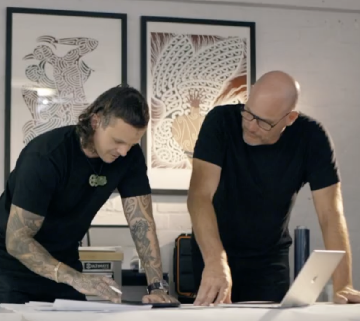
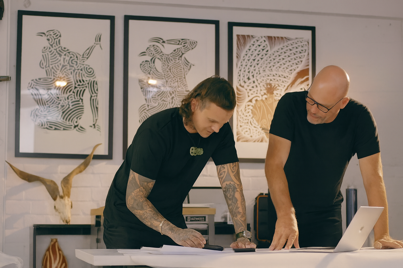
We worked with a Cohort of creative studios, who brought their unique strengths and perspectives. Geoff Suvalko from Thoughtfull Design led the design sprints, ensuring we worked towards a unified outcome across identity, experience, digital and spatial.
Our aspiration was to embed Te Ao Māori values and storytelling at the heart. We started with Kiwibank’s brand vision of “enabling Kiwi to thrive and engaged Kiwibank staff at all levels and with different lived experience to understand diverse perspectives. Further engagement was held with Māori business leaders in a variety of sectors and national Māori business and community organisations in order to deeply understand how Tāngata Whenua thrive.
To thrive is a community centric concept and can’t be done alone.
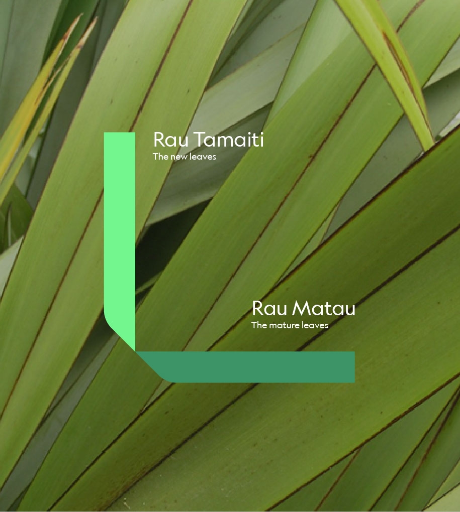
What emerged was the importance of a community centric concept of thriving. Thriving whānau create thriving communities. Through collaboration with Thoughtfull and Special Group, we shaped the identity based on the narrative of the Pā Harakeke, the consistent motif throughout the entire brand.
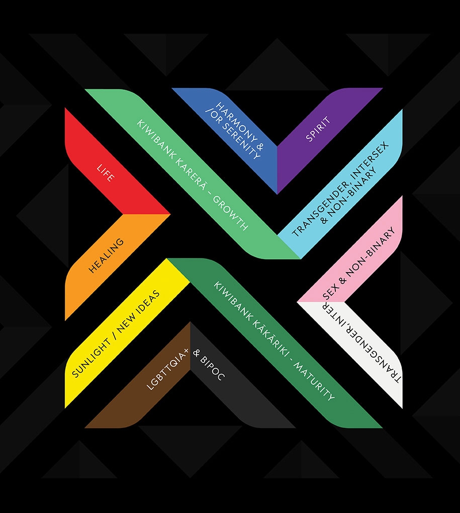
A Pā Harakeke is a grove of harakeke plants, representing a thriving village or community. Each plant is a whānau and each leaf a member of that whānau. The centre shoot is the growing generation. The surrounding leaves are the nurturing parents and grandparents.
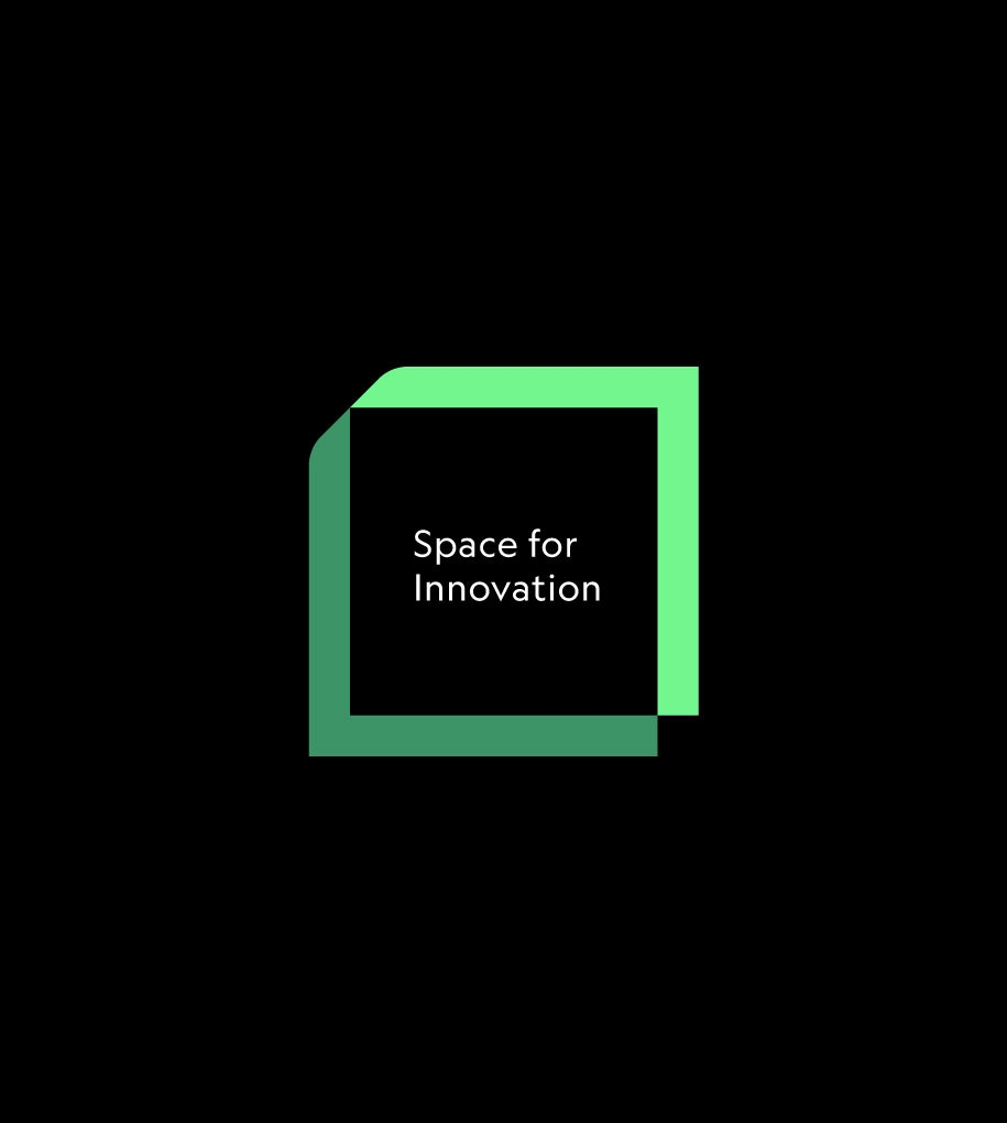
The unique form of the harakeke leaf inspired a visual language anchored in Aotearoa.
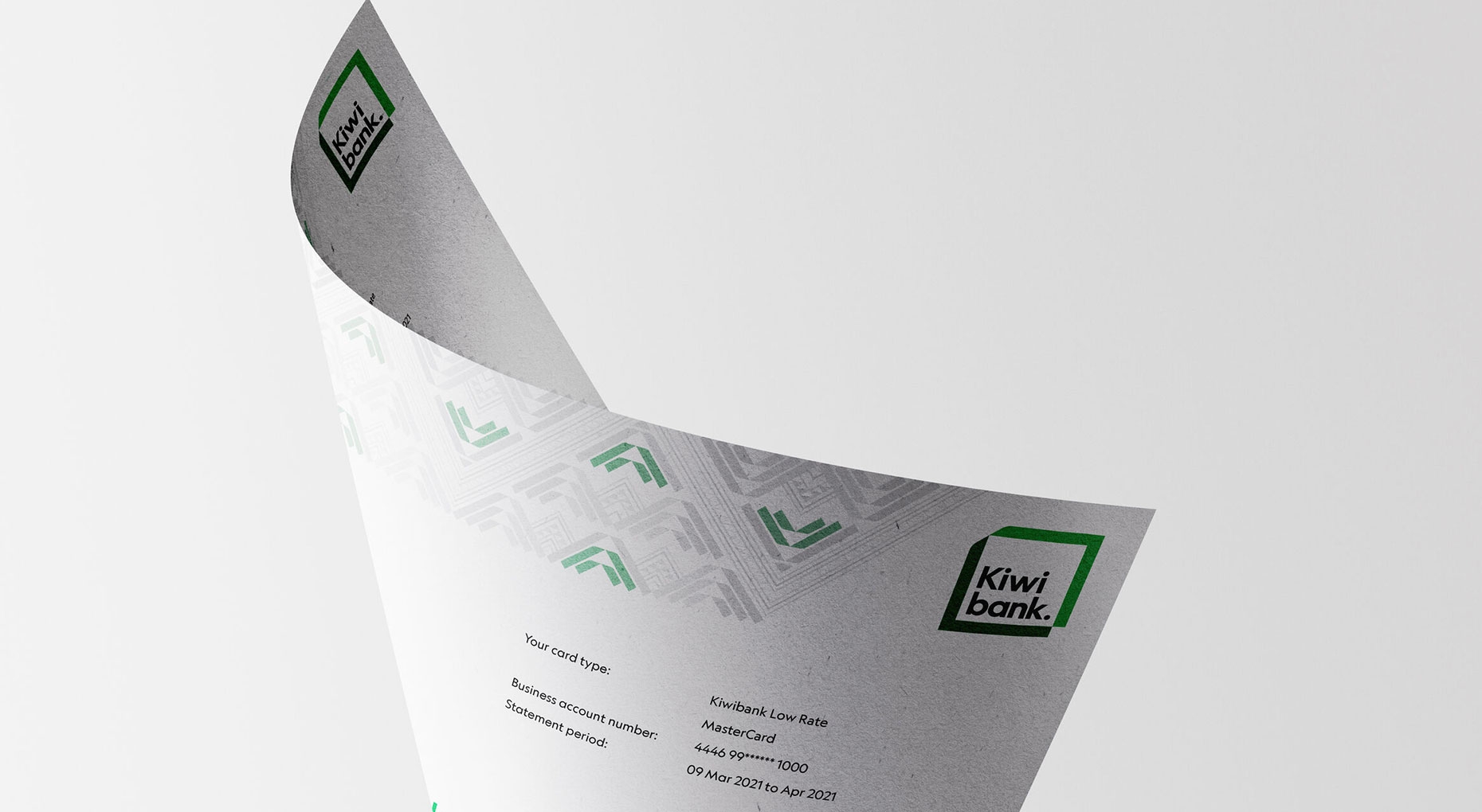
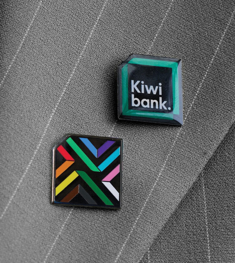
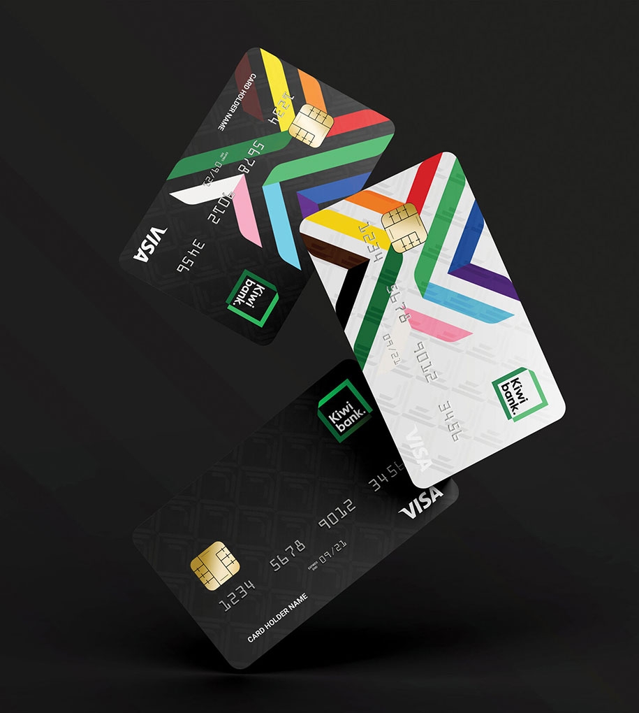
The identity is formed from a two-coloured abstract harakeke leaf that folds its way around to frame the wordmark. An active and living form that can transform into a broader visual language. The combination of dark and light green sides of the leaf express knowledge, future, growth and ambition. The top left ‘fold’ denotes culture whilst the bottom right hand ‘notch’ denotes technology.
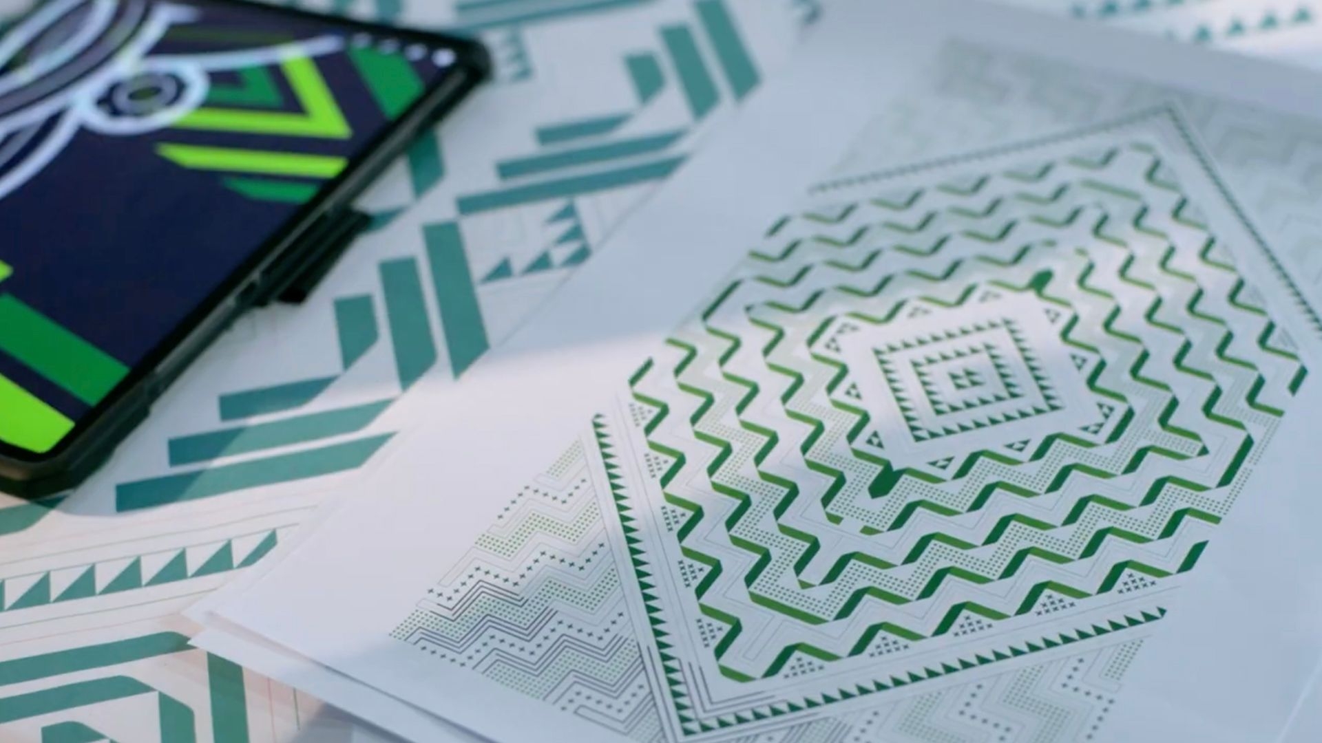
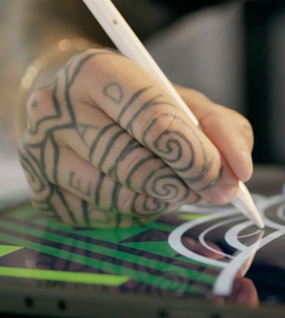
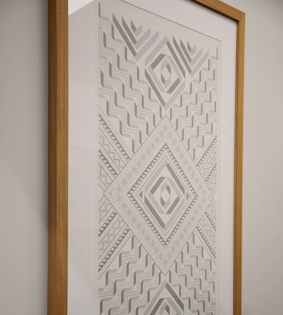
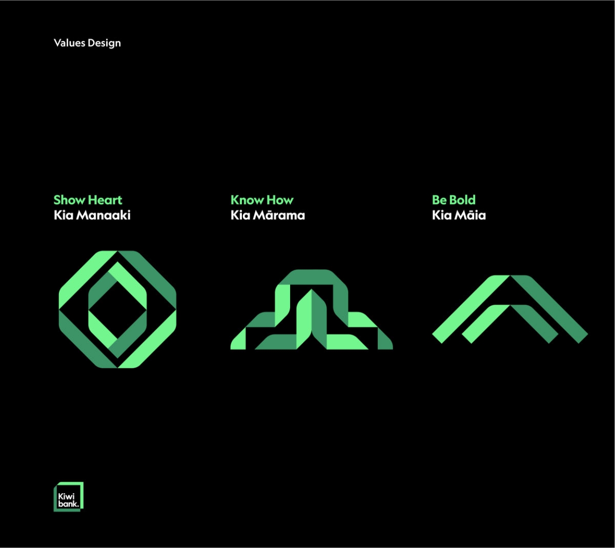
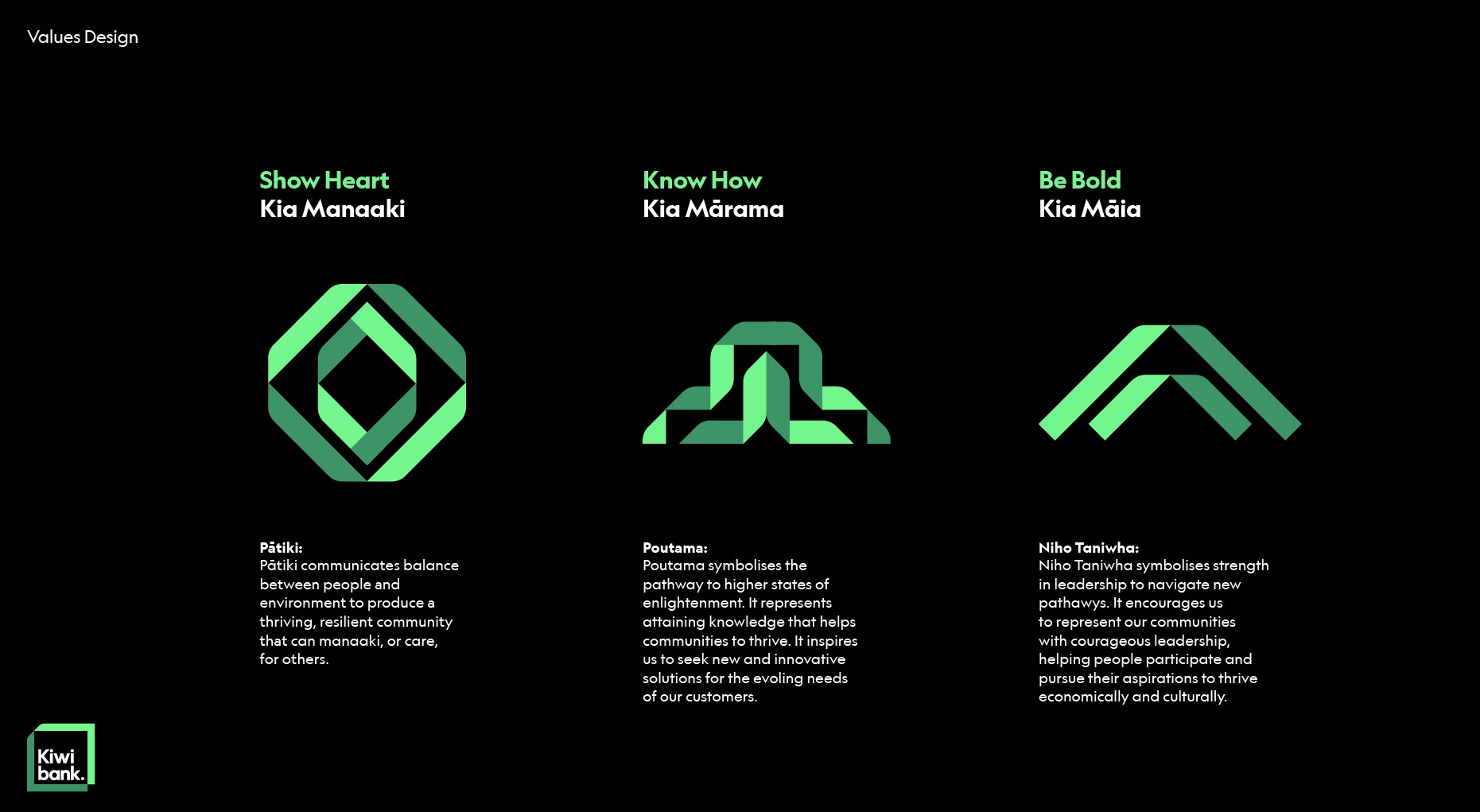
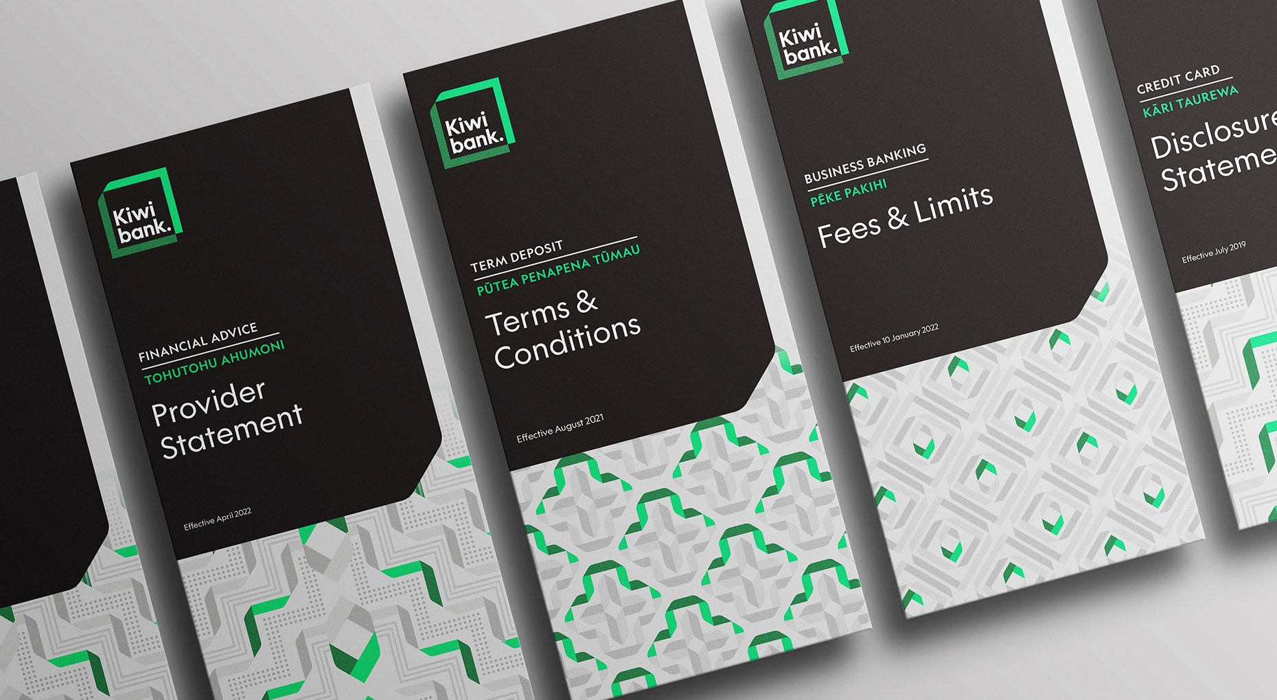
To add depth, three cultural tauira (patterns) were created that define what thriving means. Co-designed with tangata whenua artist Manawa Tapu of Te Rarawa descent, these express the three cultural values adopted by the brand to guide their commitment to Te Ao Māori. Kia Māia (Be Bold) is represented by the Niho Taniwha pattern representing courage and leadership. Kia Mānaaki (Show Heart) is represented by the Pātiki pattern, a symbol of kindness and generosity Kia Mārama (Know How) is represented by the Poutama pattern, a symbol of growth, development and insight.
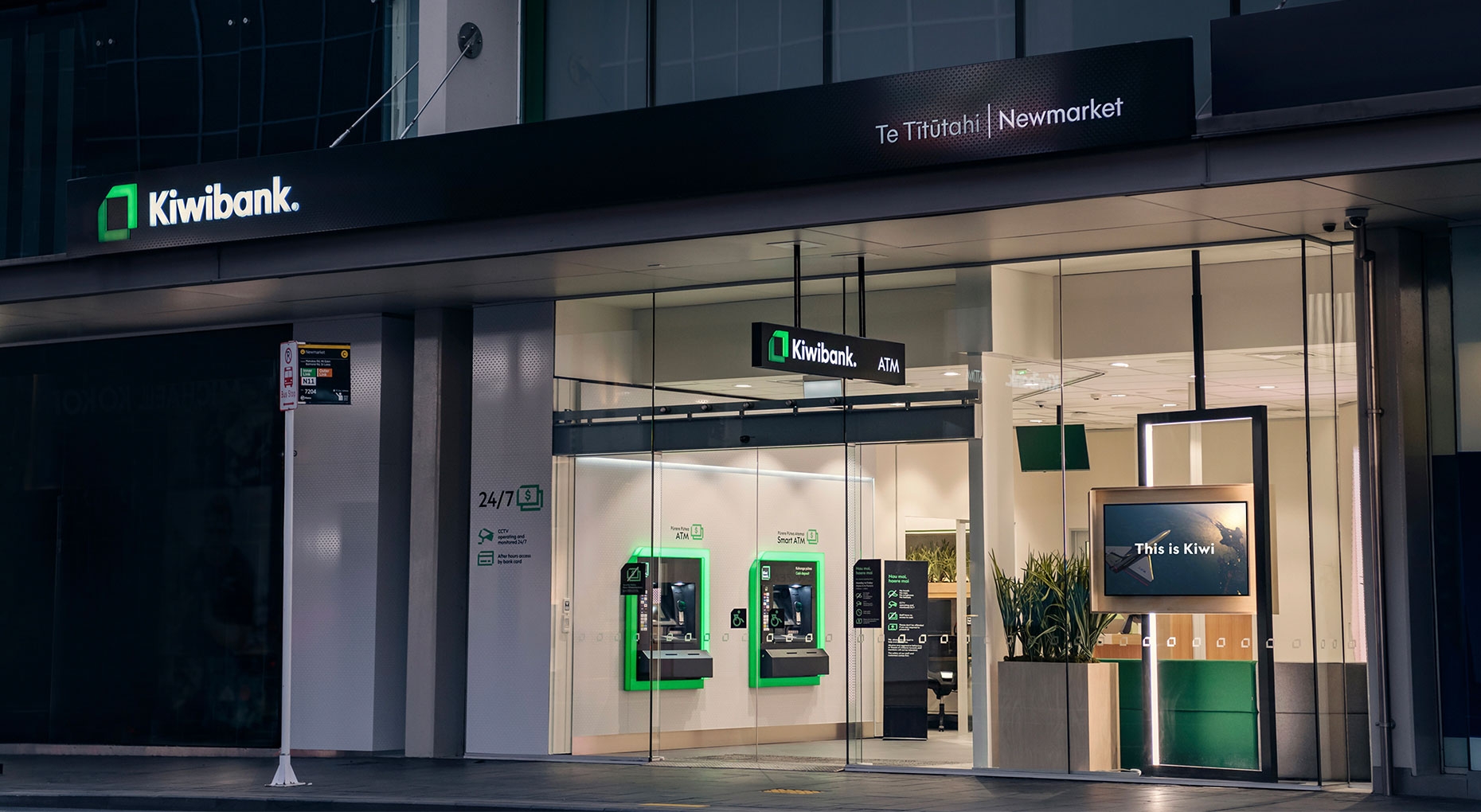
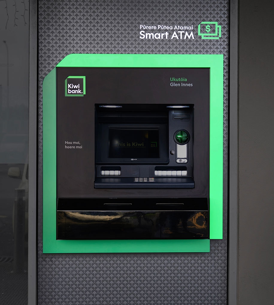
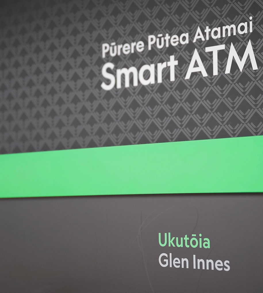
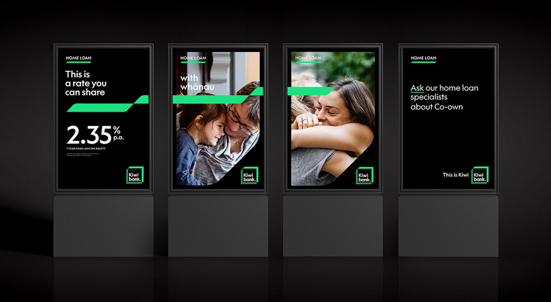
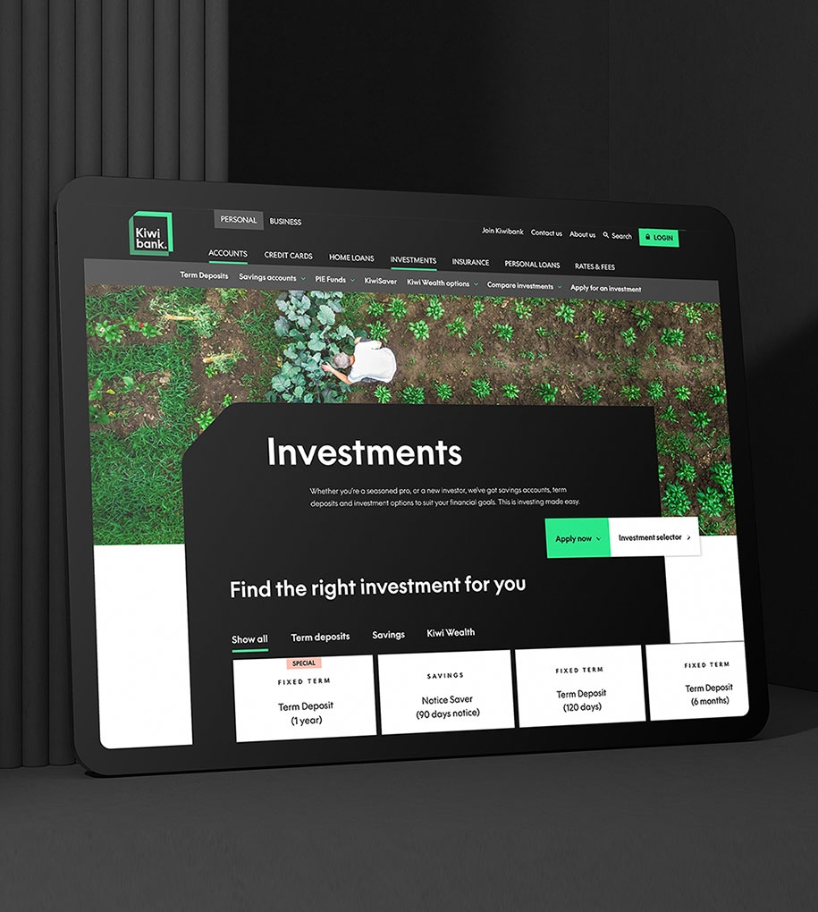
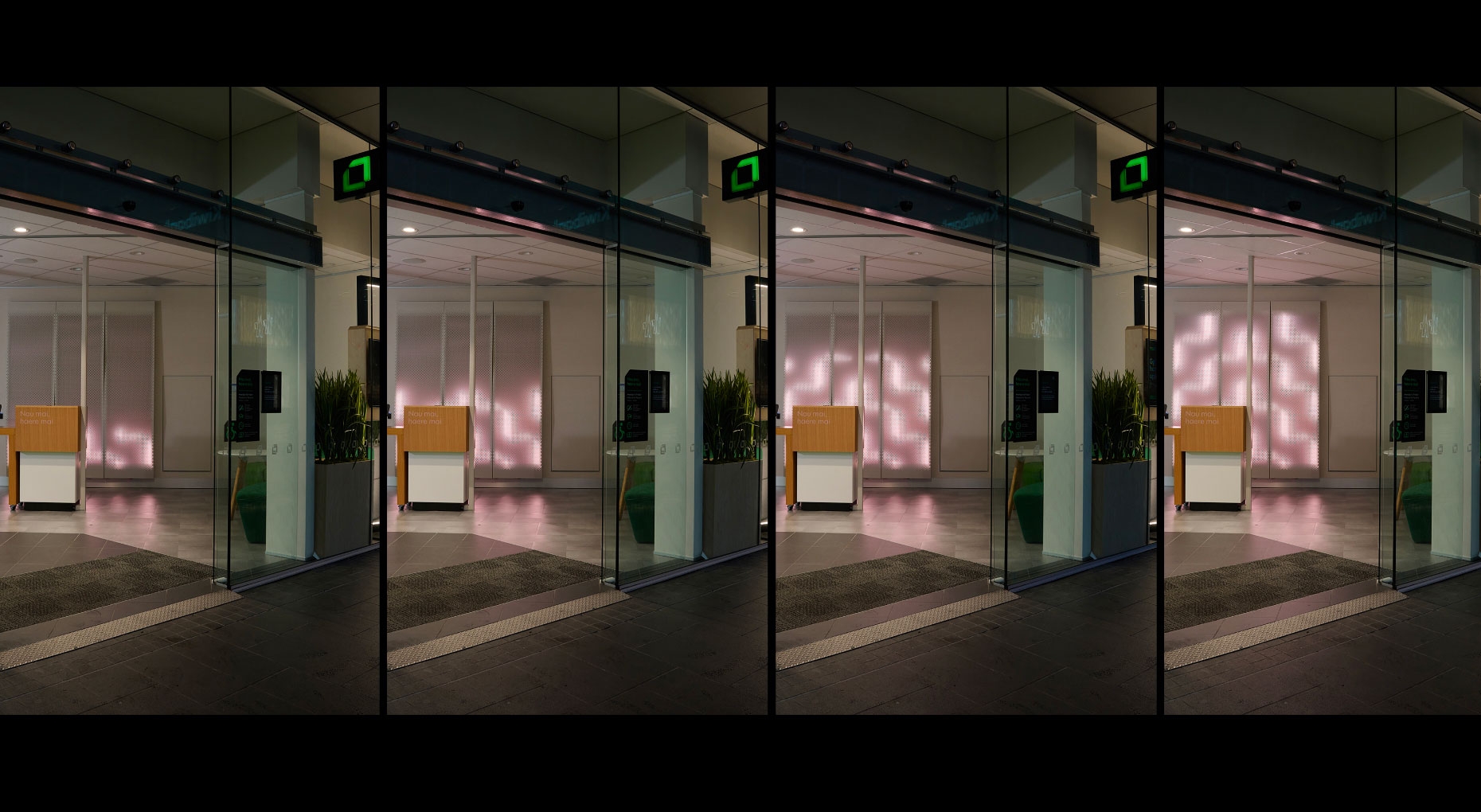
The Cohort of creative partners worked closely to ensure the visual aesthetic and narrative was applied consistently and meaningfully across every touchpoint of the customer experience. A special highlight was creating illuminated tukutuku designs within the branch, a digital wall expressing the cultural values and visual language in a modern and inviting manner.
A celebrated result that brings pride to Kiwibank’s people and customers.
Since the launch of the new brand, Kiwibank has received a string of Best Awards for cultural design, brand identity design, uniform design, spatial design and NZ Marketing Awards. But the greatest achievement is the pride the staff and customers feel engaging with a brand that celebrates what is great about being Kiwi.
Client - Simon Hoffman, Jodi Williams, Kim Waghorn, Te Aho O Te Rangi Pihama
Cultural Strategy & Creative Direction - Johnson McKay
Cultural Design - Manawa Tapu
Brand & Advertising - Thoughtfull Design, Special Group
Digital - DNA
Spatial - Retail Dimension
Strategy & Values
Brand Story
Cultural Design
Collateral Design
Collaboration on Digital, Environmental and Content Design
Best Awards 2023 - Finalist (Toitanga)