
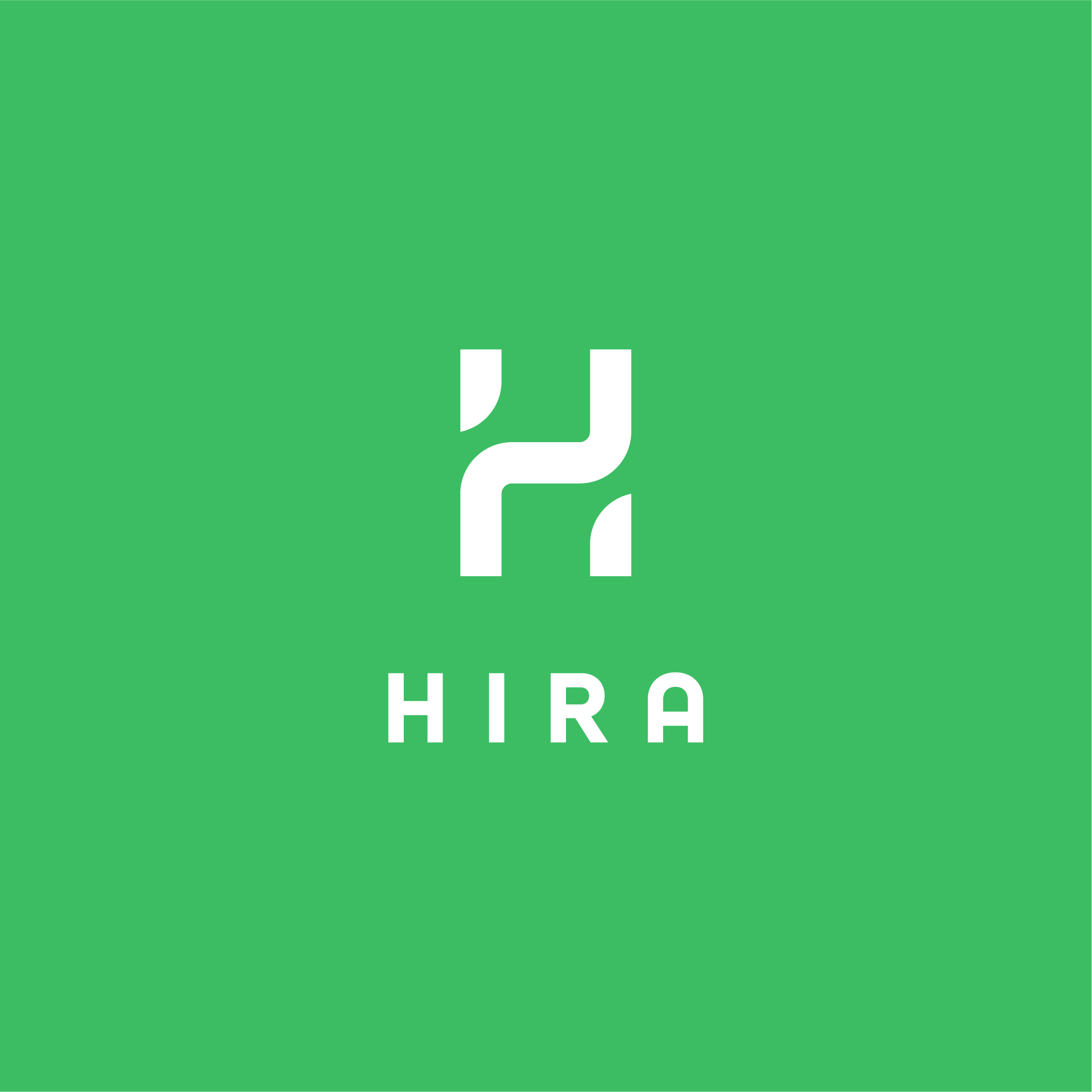
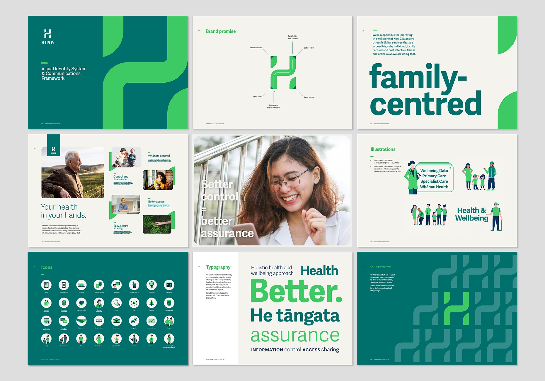
Hira represents the promise and hope of better health outcomes for all New Zealanders.
Manatū Hauora Ministry of Health has created the National Health Information Authority, a trusted source of digital services that empowers New Zealanders to have better access to their health information.
Our strategy was to develop a name and brand that would communicate key themes to diverse audiences from health professionals, to innovation experts, researchers and the public.
The brand is inspired by Tāne’s journey to the highest heavens to gain important knowledge.
The H device is inspired by a pathway at the centre, connecting whānau and health professionals together, to make informed decisions that lead to better health. It elevates upwards to represent uplifted wellbeing. When repeating it forms the poutama pattern, a representation of Tāne’s ascent.

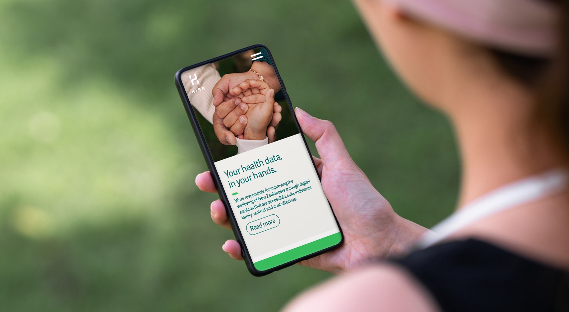
A modern, fresh expression of wellbeing and optimism.
Creative content across video, print and digital spread the word of Hira and enable messaging to remain human centric, with an innovative and optimistic expression.
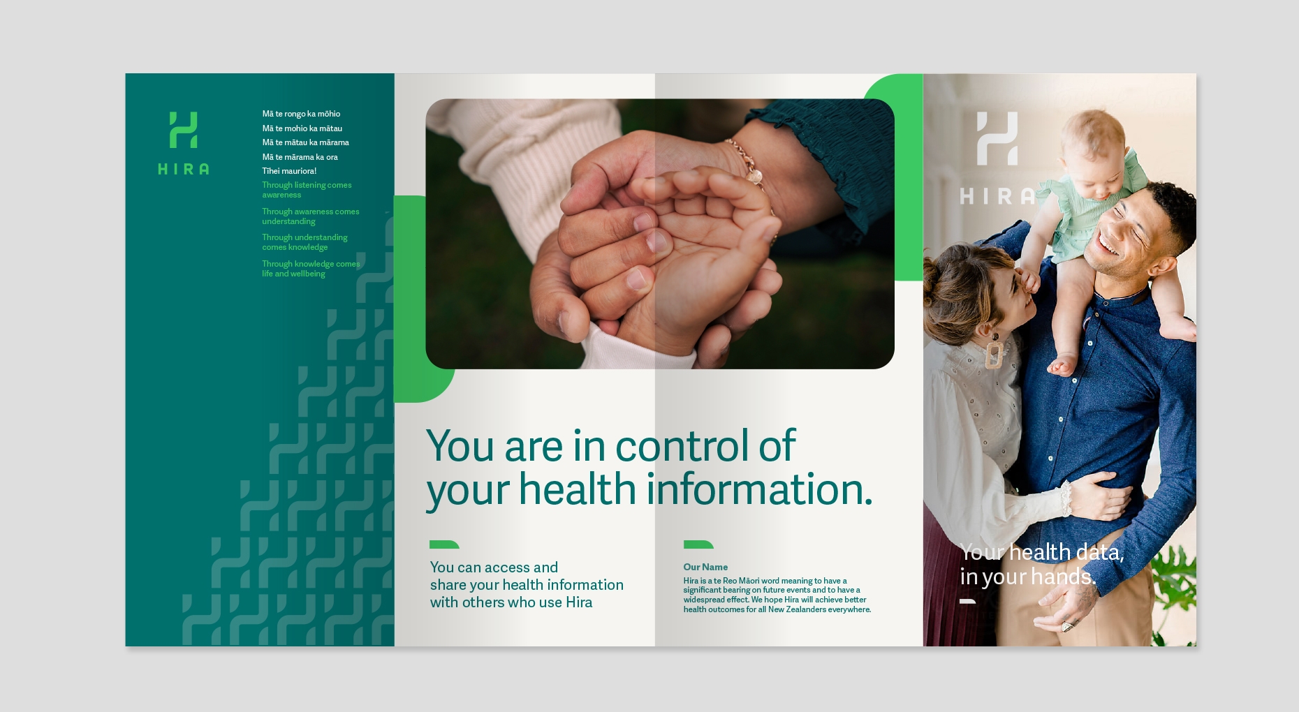
Access and share your health your health information with others who use Hira.
Kei te kapu o ō ringa te ora.
Creative Director - Johnson McKay
Design Director - Tim Hansen
Strategy - Sabine Hogguer
Design - Siobhon Joe, Storm Smith, Jason Fantonial
Strategy
Design & Illustration
Photography, Video
Motion
Social, Digital

