We do not have equitable access to cancer prevention and care in Aotearoa.
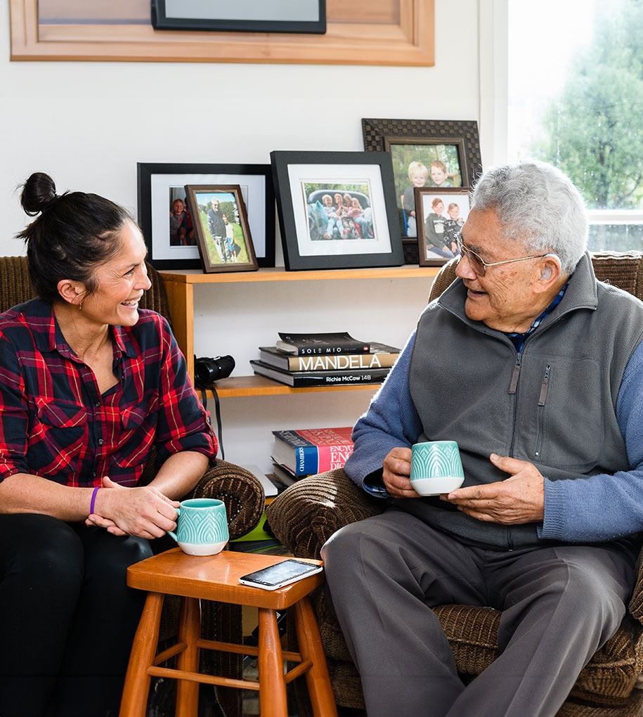
Every New Zealander has been affected by cancer in some way. As a nation we demanded better cancer prevention and care. The Cancer Control Agency was formed in late 2019 and we were asked to assist in the naming, brand strategy and identity for what is one of our most important health agencies.
A te reo Māori name that is not just icing on top, but a commitment.
We worked under the leadership of Dr Diana Sarfati, Chief Executive of the newly formed Cancer Control Agency to develop vision, purpose, values and a brand name and identity. Through a series of wānanga workshops with recently hired staff and whānau affected by cancer and the cultural and health experts at Hei Āhuru Mōwai Māori Cancer Leadership, we developed a clear brand strategy that focussed on the role the Cancer Control Agency would play in cancer prevention and care.
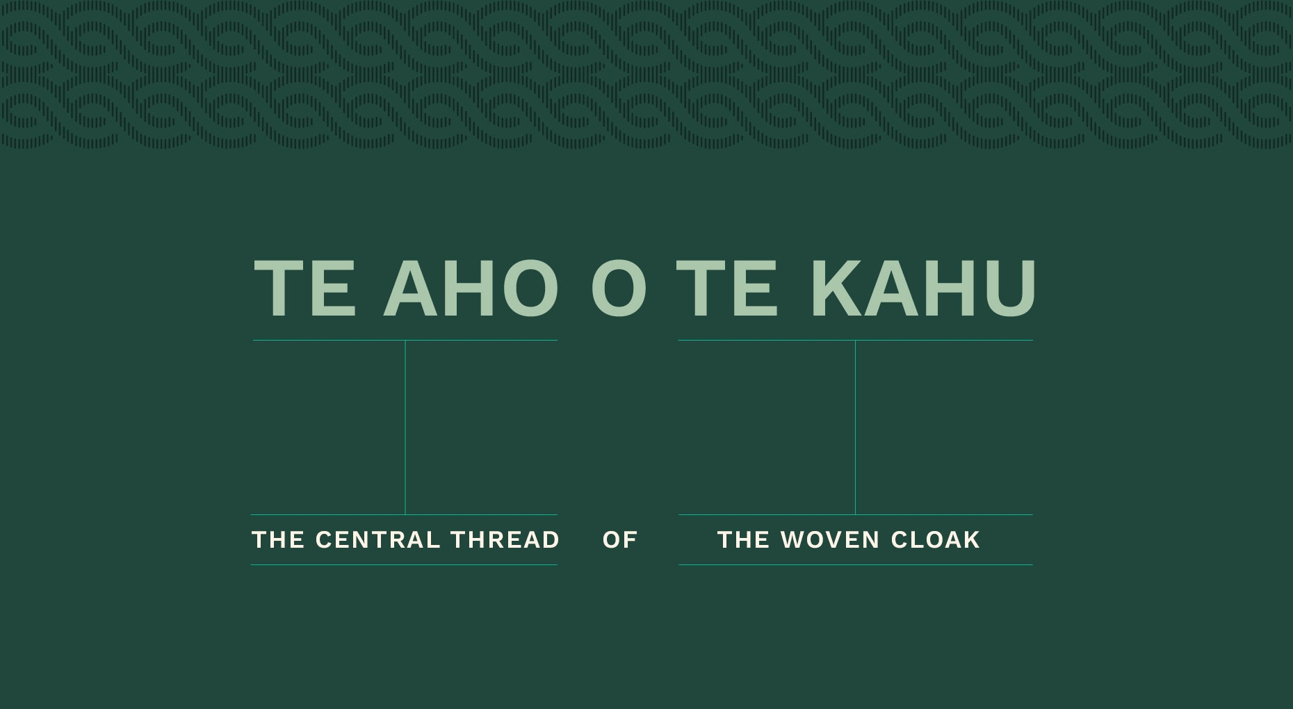
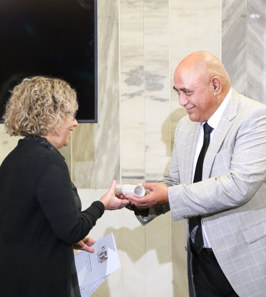
The process towards a Māori name began with genuine engagement with the Māori community to understand their hopes and expectations. Through a series of wānanga with leading experts in te ao Māori, the Cancer Control Agency was gifted the name Te Aho o Te Kahu by representatives of the Māori community at the Beehive on 18th of June 2020.
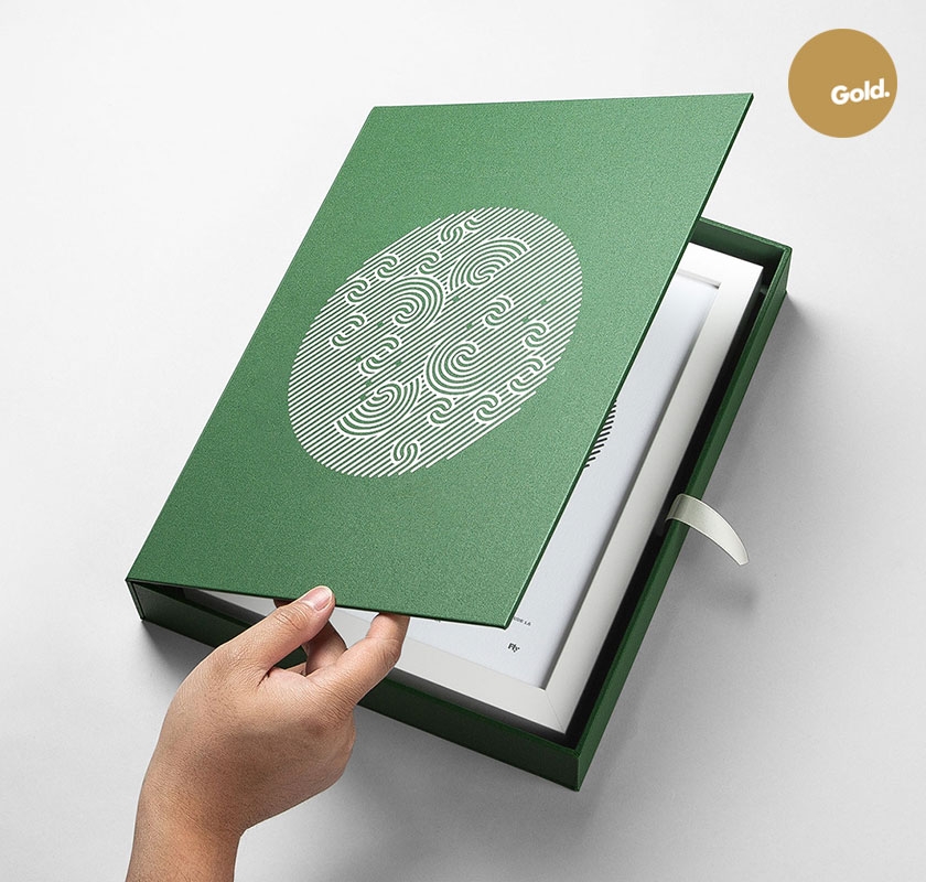
The name refers to the process of weaving a cloak, a kahu. The aho is the central thread that binds all strands of the kahu together. It represents the leadership role Te Aho o Te Kahu has in improving cancer prevention and care in New Zealand. The first Aho woven also provides the framework for subsequent Aho to be woven. This reminds Te Aho o Te Kahu that they are still in the process of delivering better health comes and the work is yet before us.
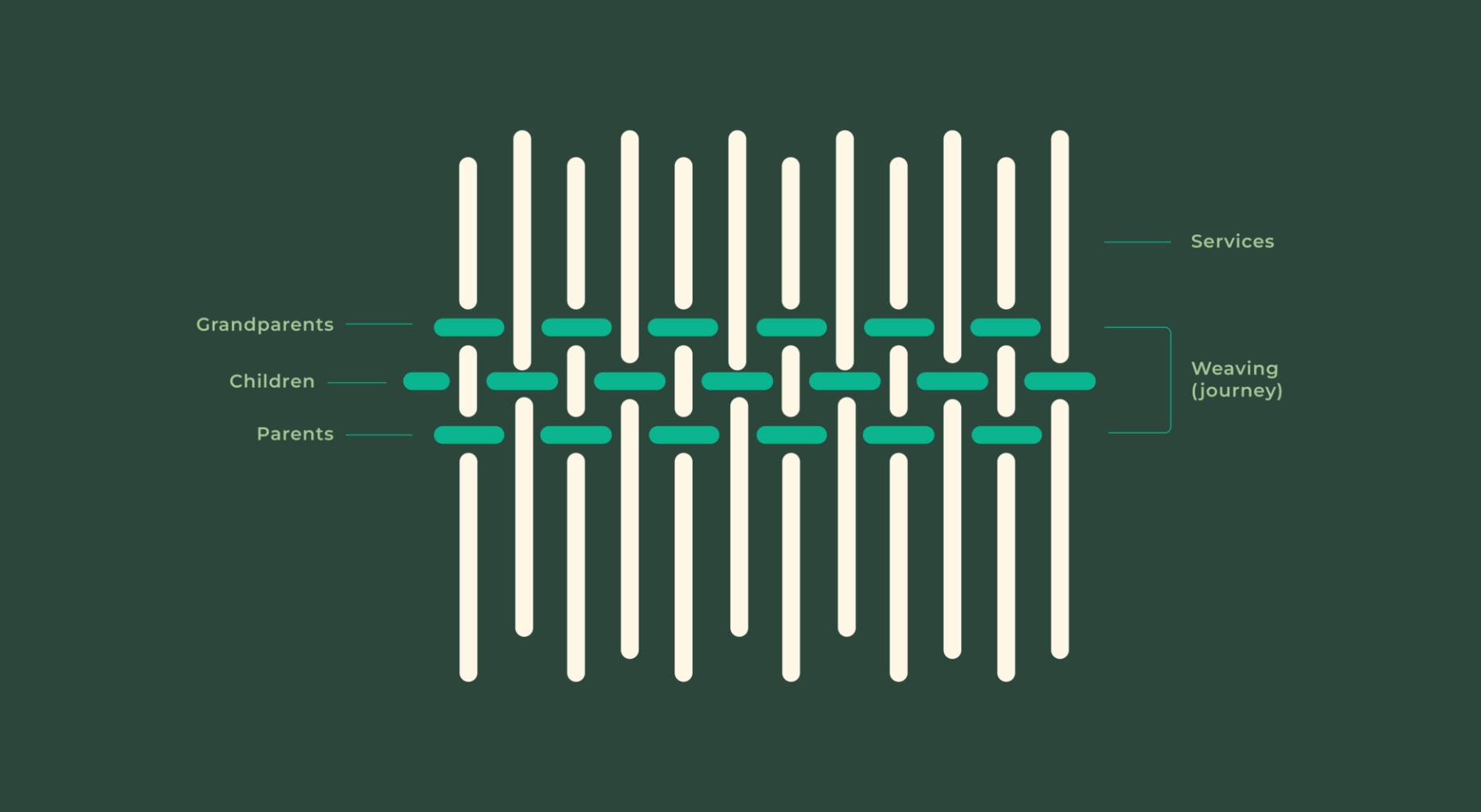
The aho is the central thread in the brand, connecting to the name.
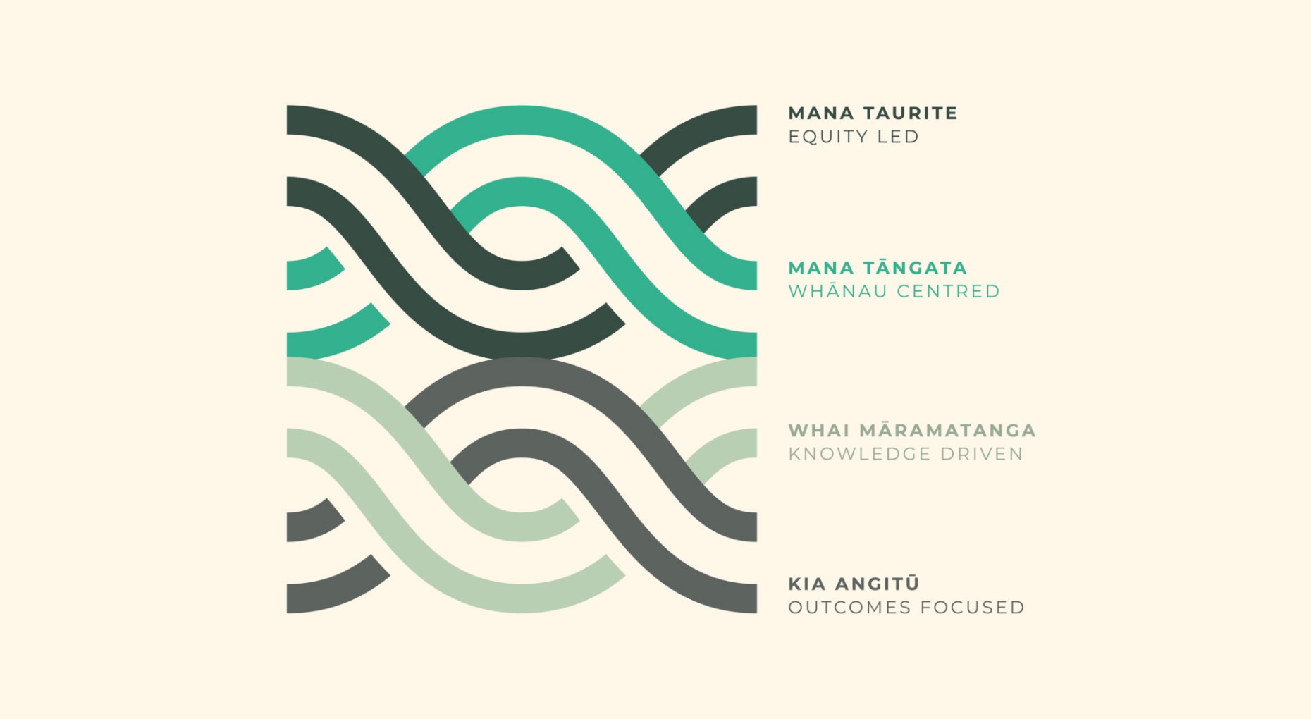
The four threads that weave together to form the Aho represent the values of equity led (mana taurite), people and whānau centred (mana tāngata), knowledge driven (Whai māramatanga) and outcomes focussed (kia angitū). These values form the protective framework that will guide Te Aho o Te Kahu to be authentic to their purpose.
The colour palette represents the journey of the muka that is extracted from the harakeke plant and used to weave cloaks. The fresh greens represent the Rito of the harakeke, or the centre shoot and how it grows into mature, darker green leaves that form a protective shelter around the centre shoot. The muka is extracted out of the leaves and has a cream colour.
A name with a wero, an organisation with a purpose.
The name itself contains a wero, or a challenge to Te Aho o Te Kahu. The aho represents the beginning of the binding process of the horizontal strands of the cloak. But the cloak remains yet to be woven. This expresses the reality that until all New Zealanders have access to equity care and prevention, there is work to be done.
Client - Diana Sarfati, Chief Executive
Creative Direction - Johnson Mckay
Design Direction - Tim Hansen
Design - Jason Fantonial, Storm Smith, Siobhon Joe
Motion - Malachi McKay
Account Manager - Adeline Chua, Tanya Smith
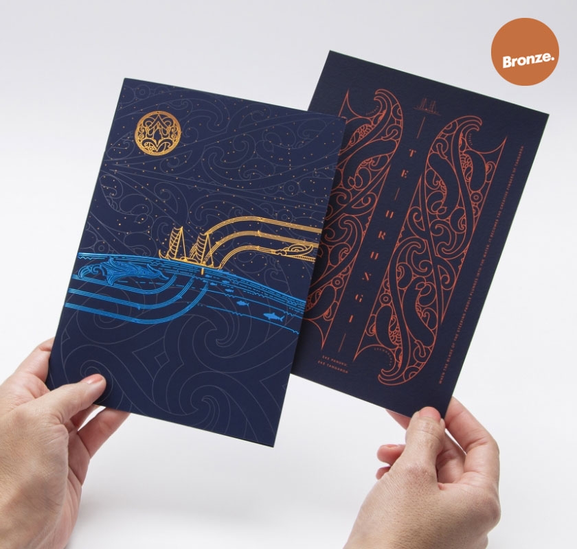
Strategy
Cultural Narrative
Brand Identity
Brand Guidelines
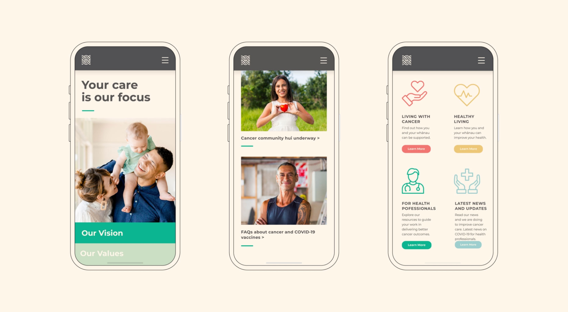
Digital Design
Collateral Design